Double Sharp Experiments
© No Walls Studio 2021
A sensory dialogue on spaces (and life). Centered on humans. We curate these experiments to shape (and reshape) how we navigate, consume and define the world—all, in an effort to avoid same and push the boundaries of placemaking.
001 - 004
/ DRAG ME < >
WORK
WORK

Fifty-Five Riverwalk

THE SHORT

Where cosmopolitan meets calm.

Aker Companies
Port Imperial, NJ

A new kind of waterfront address.

FOCUS

Consumer Research & Insights
Positioning
Brand Concepting
Messaging
Brand & Identity Development
Art Direction & Photography
Brand & Visual Guidelines
Collateral Design
Web Design (JONAH)

Consumer Research & Insights
Positioning
Brand Concepting
Messaging
Brand & Identity Development
Art Direction & Photography
Brand & Visual Guidelines
Collateral Design
Web Design (JONAH)

APPROACH
APPROACH

No Walls Studio partnered with Aker to reposition an existing development in Port Imperial, New Jersey—just across the Hudson River from Manhattan. The challenge? Cut through a market flooded with similar properties and create a brand that delivered something different: intrigue, identity, and elevated ease.

We began by diving deep into the landscape. While most buildings in the area leaned heavily on generic luxury cues, we saw an opportunity to bring something more layered to life: a place that carried the poise and perspective of city living, but with room to exhale.

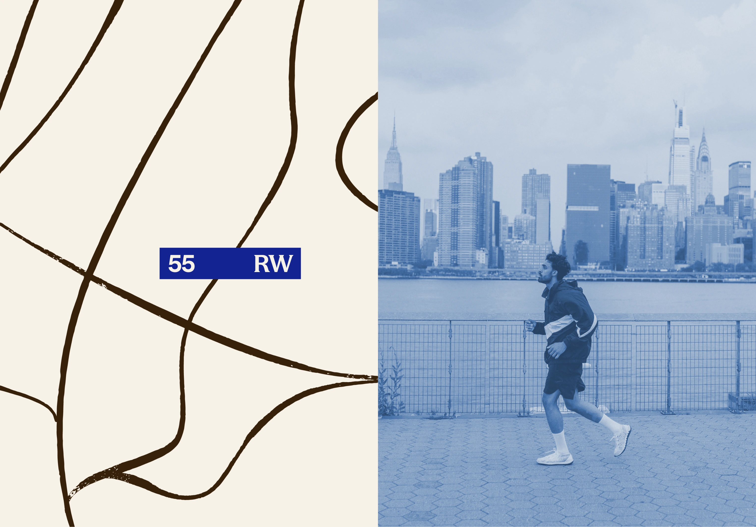
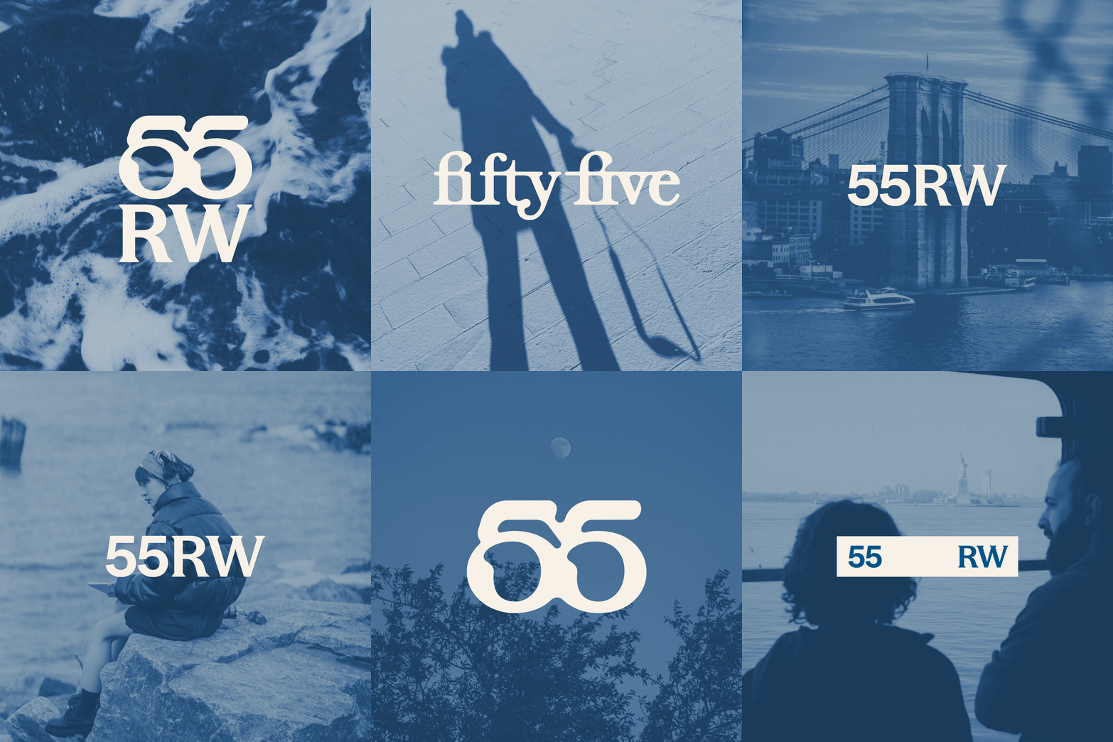
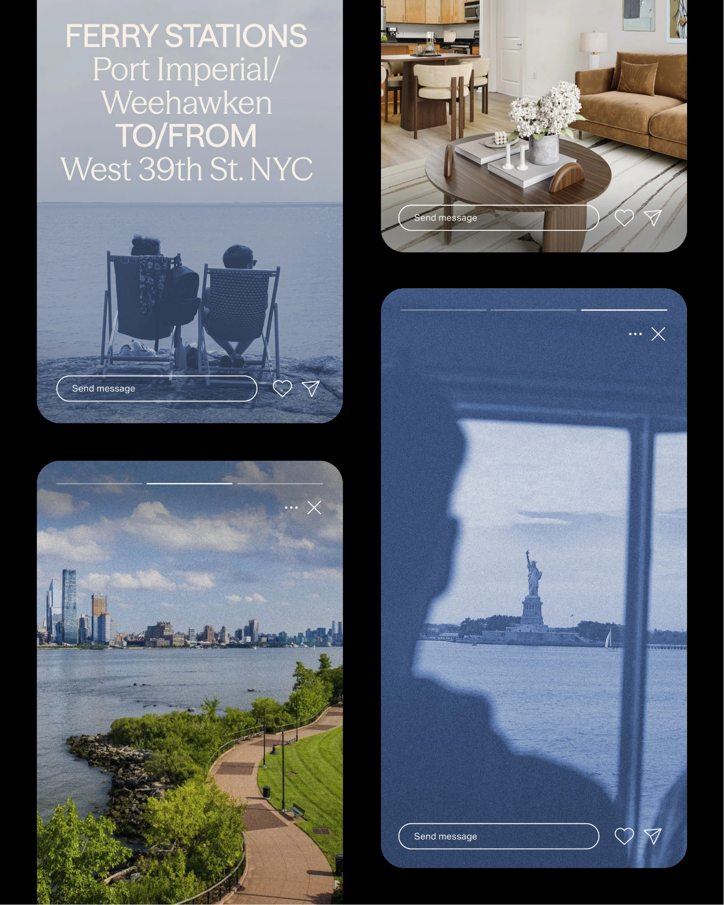
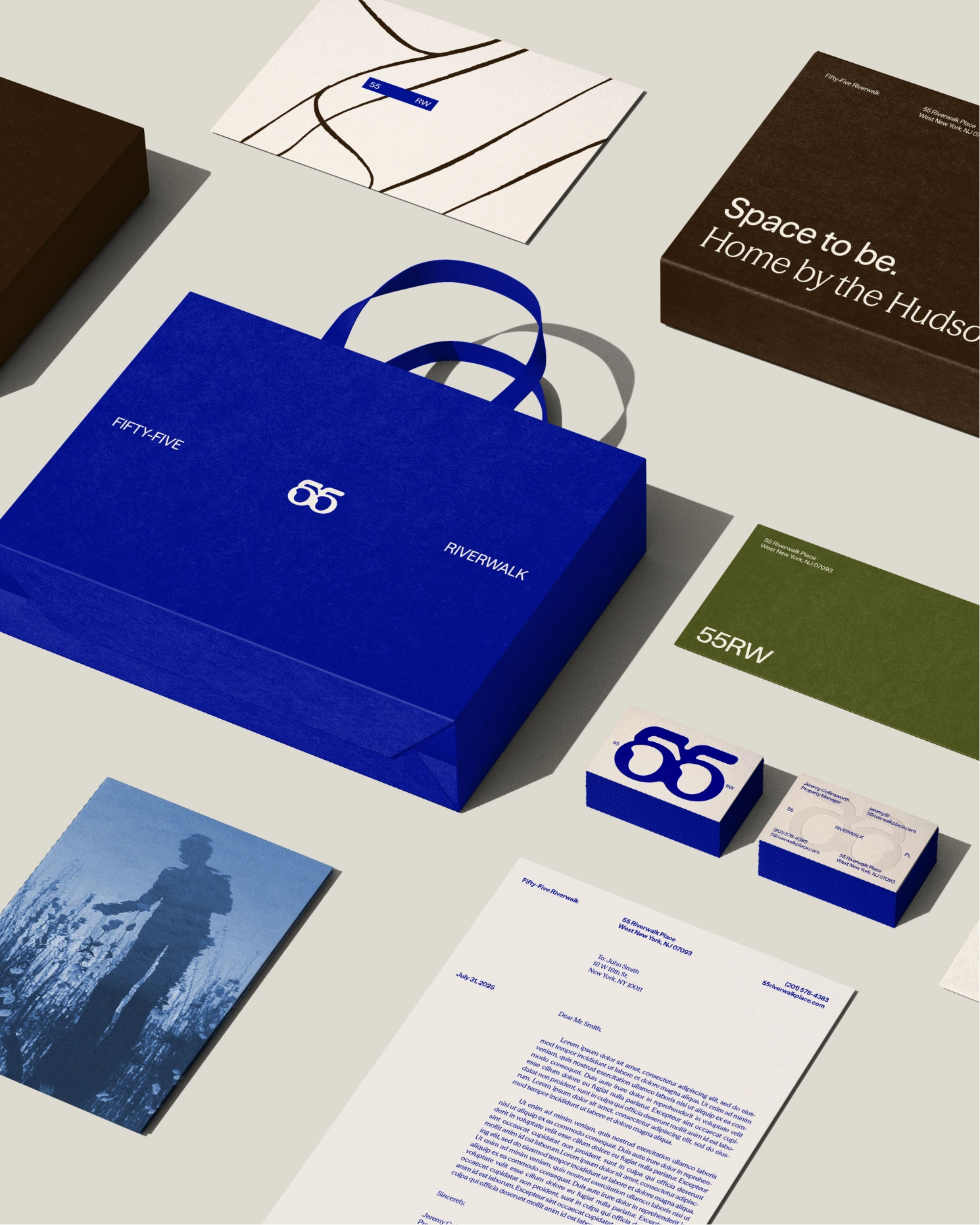
Working within an inherited naming system, we reimagined Fifty-Five Riverwalk to feel editorial, emotive, and globally aware. The concept of “Ohhh meets Ahhh” guided the balance: worldliness with warmth, edge with ease. We designed a brand that felt fresh, clean, and quietly magnetic—supported by custom illustrations, elevated typography, and cyanotype-style photography that nods to both nature and art.

The result is a brand that feels unlike anything else on the New Jersey waterfront. One that feels just as at home in the design districts of Brooklyn or London as it does perched above the Hudson.

Aker Companies
Port Imperial, NJ

A brand built for the other side of the river.

Fifty-Five Riverwalk repositions the Port Imperial waterfront as more than just an alternative to Manhattan. It reframes it as a destination in its own right. We created a brand identity that channels editorial energy and coastal calm, mixing bold simplicity with moments of subtle intrigue. The goal wasn’t just to feel new, but to feel next. This wasn’t a cosmetic update. From visual direction to the voice and tone, every element was designed to spark curiosity, and give renters a sense of stylish belonging–all without the intensity of Manhattan.

Aker Companies
Port Imperial, NJ

The “ohh” and the “ahh,” applied everywhere.

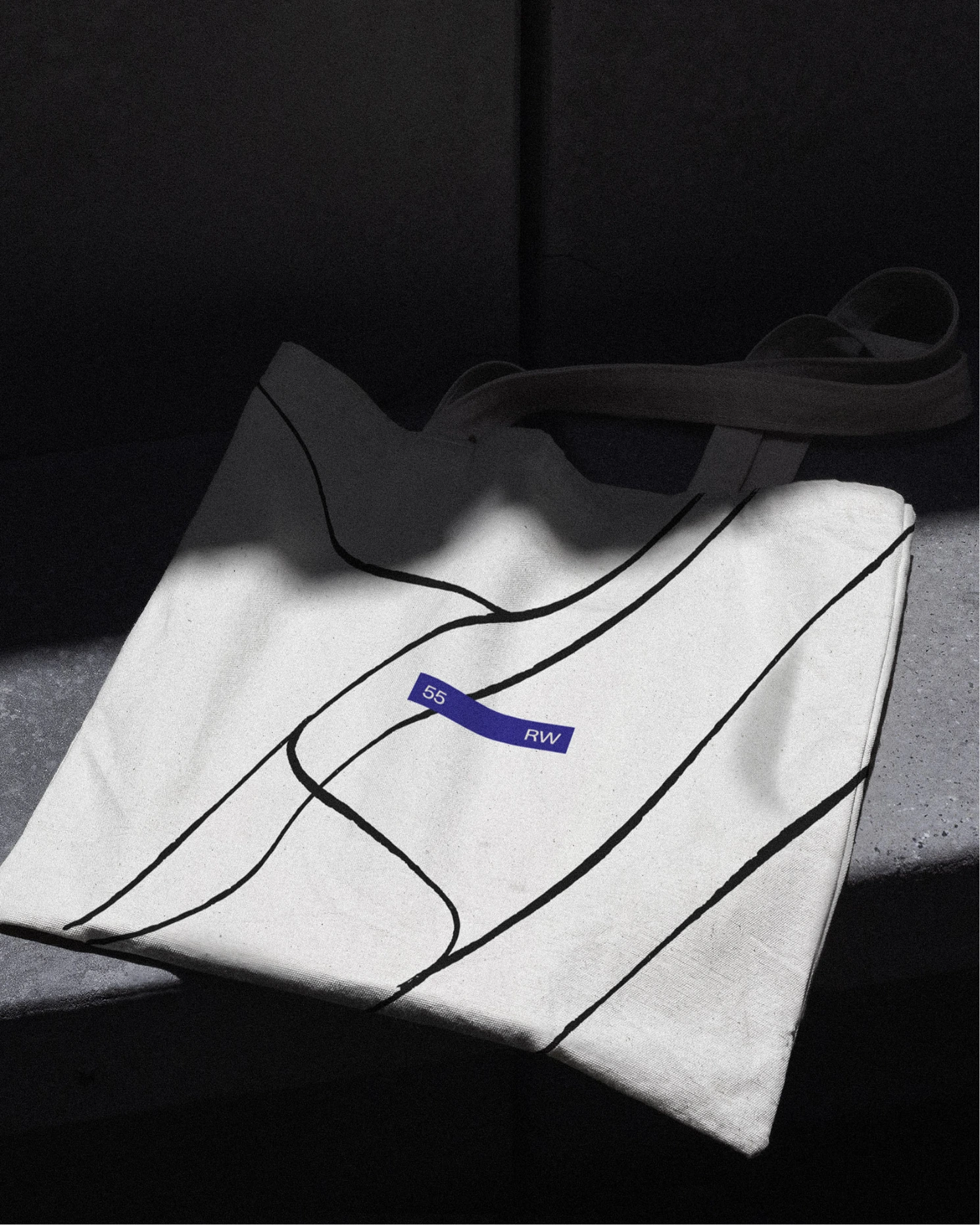
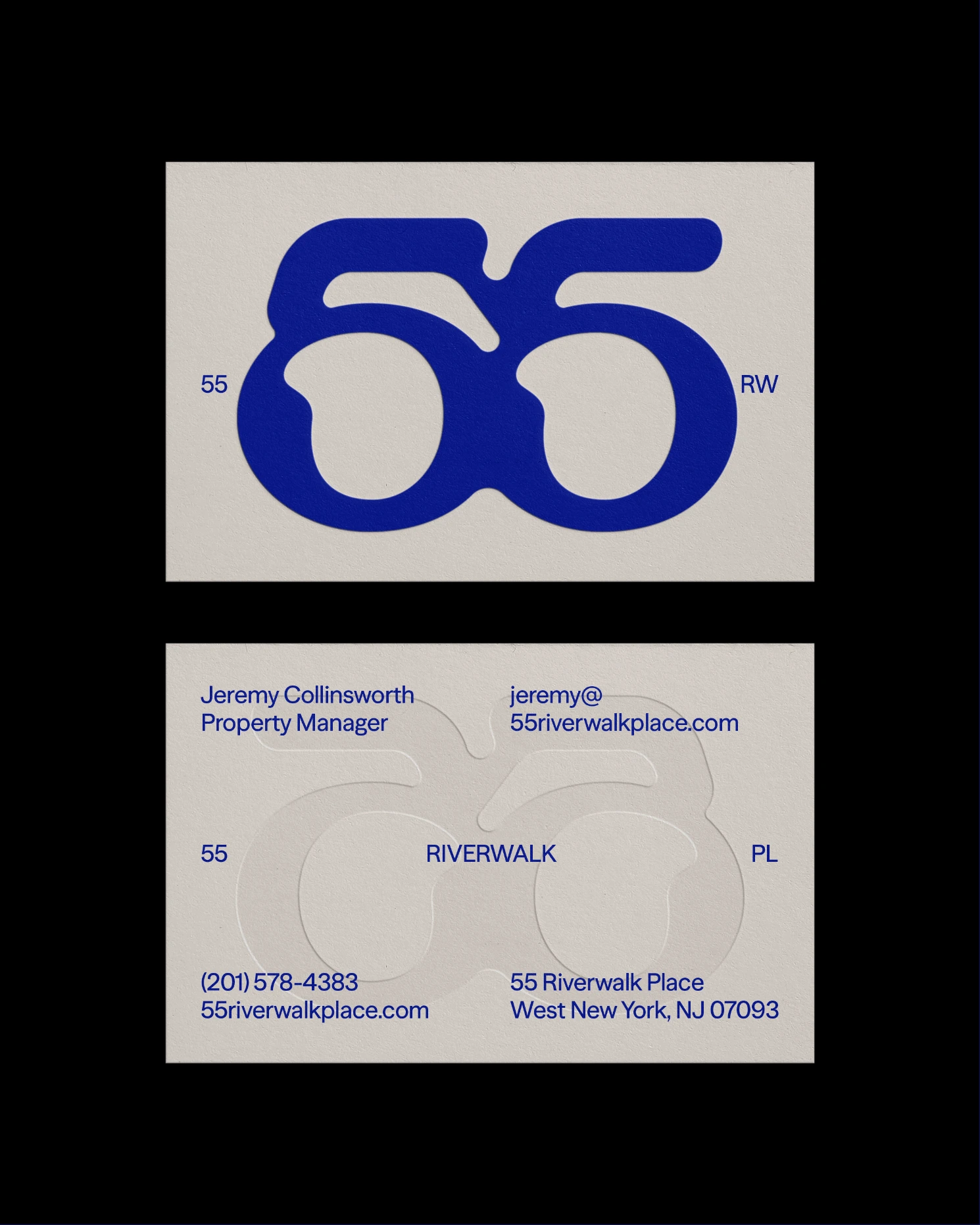
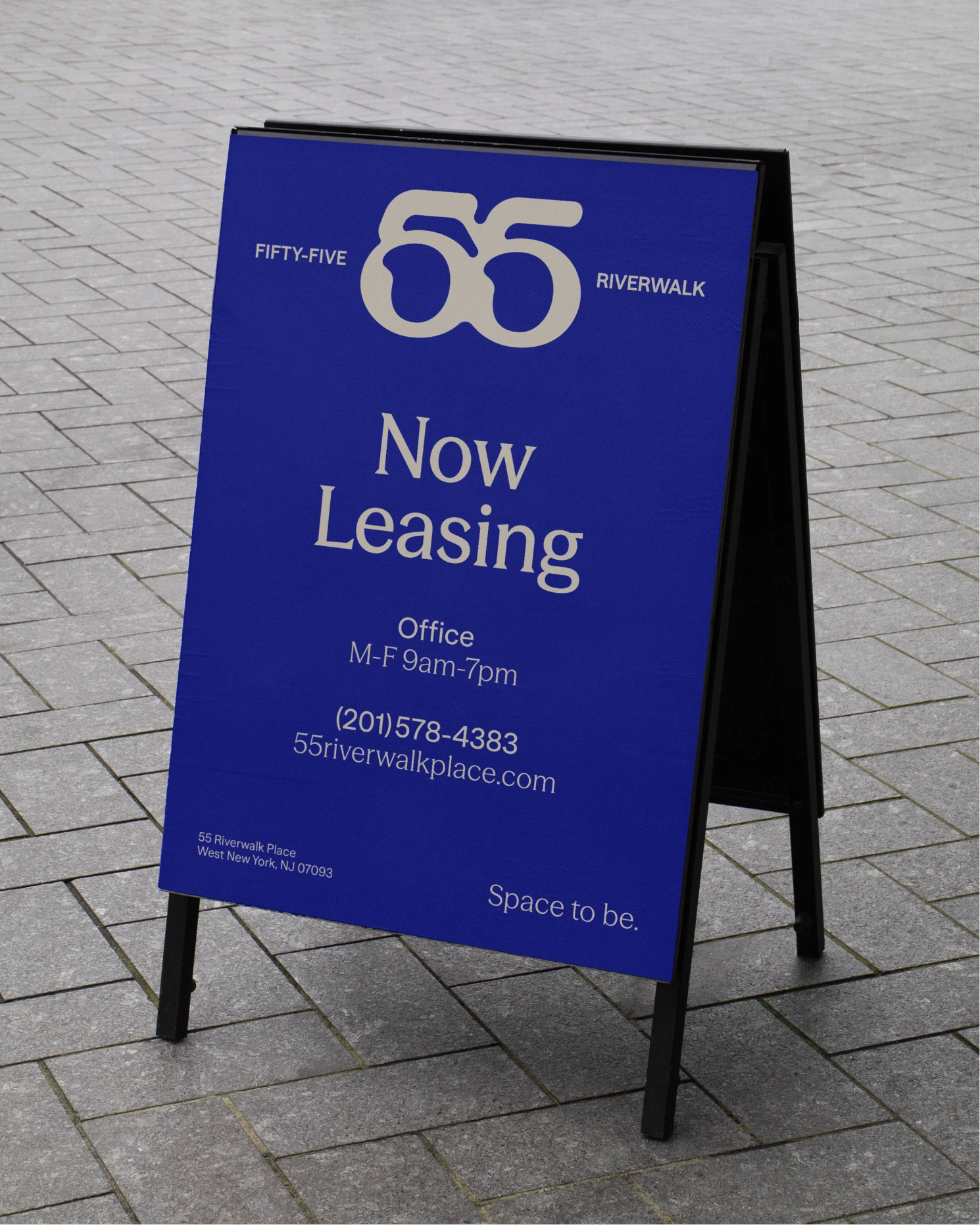
From postcards to web, every brand touchpoint at Fifty-Five Riverwalk carries the balance of contrast—cosmopolitan intrigue and calming ease. The visual language doesn’t just sit on the surface; it lives in the spacing, the materials, the tone of voice. It’s how an A-frame sign feels considered, how a business card suggests sophisticated chill. Everywhere you look, the identity delivers both a sense of arrival and a sense of exhale.

Aker Companies

THE SHORT

Where cosmopolitan meets calm.

ID
Port Imperial, NJ

A new kind of waterfront address.

FOCUS

Consumer Research, Brand Identity, Art Direction, Web Design +5

/Approach

What’s a Rich Text element?

The rich text element allows you to create and format headings, paragraphs, blockquotes, images, and video all in one place instead of having to add and format them individually. Just double-click and easily create content.

Static and dynamic content editing

A rich text element can be used with static or dynamic content. For static content, just drop it into any page and begin editing. For dynamic content, add a rich text field to any collection and then connect a rich text element to that field in the settings panel. Voila!

How to customize formatting for each rich text

Headings, paragraphs, blockquotes, figures, images, and figure captions can all be styled after a class is added to the rich text element using the "When inside of" nested selector system.

Lorem ipsum dolor sit amet, consetetur sadipscing elitr, sed diam nonumy eirmod tempor invidunt ut labore et dolore magna aliquyam erat, sed diam voluptua. At vero eos et accusam et justo duo dolores et ea rebum.

Stet clita kasd.Lorem ipsum dolor sit amet, consetetur sadipscing elitr, sed diam nonumy eirmod tempor invidunt ut labore et dolore magna aliquyam erat, sed diam voluptua. At vero eos et accusam et justo duo dolores et ea rebum.

Where cosmopolitan meets calm.

Fifty-Five Riverwalk

THE SHORT

Where cosmopolitan meets calm.

Aker Companies
Port Imperial, NJ

A new kind of waterfront address.

FOCUS

Consumer Research & Insights
Positioning
Brand Concepting
Messaging
Brand & Identity Development
Art Direction & Photography
Brand & Visual Guidelines
Collateral Design
Web Design (JONAH)

Consumer Research & Insights
Positioning
Brand Concepting
Messaging
Brand & Identity Development
Art Direction & Photography
Brand & Visual Guidelines
Collateral Design
Web Design (JONAH)

APPROACH
APPROACH

No Walls Studio partnered with Aker to reposition an existing development in Port Imperial, New Jersey—just across the Hudson River from Manhattan. The challenge? Cut through a market flooded with similar properties and create a brand that delivered something different: intrigue, identity, and elevated ease.

We began by diving deep into the landscape. While most buildings in the area leaned heavily on generic luxury cues, we saw an opportunity to bring something more layered to life: a place that carried the poise and perspective of city living, but with room to exhale.

Working within an inherited naming system, we reimagined Fifty-Five Riverwalk to feel editorial, emotive, and globally aware. The concept of “Ohhh meets Ahhh” guided the balance: worldliness with warmth, edge with ease. We designed a brand that felt fresh, clean, and quietly magnetic—supported by custom illustrations, elevated typography, and cyanotype-style photography that nods to both nature and art.

The result is a brand that feels unlike anything else on the New Jersey waterfront. One that feels just as at home in the design districts of Brooklyn or London as it does perched above the Hudson.

Aker Companies
Port Imperial, NJ

THE GOODS

Fifty-Five Riverwalk repositions the Port Imperial waterfront as more than just an alternative to Manhattan. It reframes it as a destination in its own right. We created a brand identity that channels editorial energy and coastal calm, mixing bold simplicity with moments of subtle intrigue. The goal wasn’t just to feel new, but to feel next. This wasn’t a cosmetic update. From visual direction to the voice and tone, every element was designed to spark curiosity, and give renters a sense of stylish belonging–all without the intensity of Manhattan.

Aker Companies
Port Imperial, NJ

THE SPACE

From postcards to web, every brand touchpoint at Fifty-Five Riverwalk carries the balance of contrast—cosmopolitan intrigue and calming ease. The visual language doesn’t just sit on the surface; it lives in the spacing, the materials, the tone of voice. It’s how an A-frame sign feels considered, how a business card suggests sophisticated chill. Everywhere you look, the identity delivers both a sense of arrival and a sense of exhale.

Fifty-Five Riverwalk

THE SHORT

Where cosmopolitan meets calm.

Aker Companies
Port Imperial, NJ

A new kind of waterfront address.

FOCUS

Consumer Research & Insights
Positioning
Brand Concepting
Messaging
Brand & Identity Development
Art Direction & Photography
Brand & Visual Guidelines
Collateral Design
Web Design (JONAH)

Consumer Research & Insights
Positioning
Brand Concepting
Messaging
Brand & Identity Development
Art Direction & Photography
Brand & Visual Guidelines
Collateral Design
Web Design (JONAH)

APPROACH
APPROACH

No Walls Studio partnered with Aker to reposition an existing development in Port Imperial, New Jersey—just across the Hudson River from Manhattan. The challenge? Cut through a market flooded with similar properties and create a brand that delivered something different: intrigue, identity, and elevated ease.

We began by diving deep into the landscape. While most buildings in the area leaned heavily on generic luxury cues, we saw an opportunity to bring something more layered to life: a place that carried the poise and perspective of city living, but with room to exhale.

Working within an inherited naming system, we reimagined Fifty-Five Riverwalk to feel editorial, emotive, and globally aware. The concept of “Ohhh meets Ahhh” guided the balance: worldliness with warmth, edge with ease. We designed a brand that felt fresh, clean, and quietly magnetic—supported by custom illustrations, elevated typography, and cyanotype-style photography that nods to both nature and art.

The result is a brand that feels unlike anything else on the New Jersey waterfront. One that feels just as at home in the design districts of Brooklyn or London as it does perched above the Hudson.

Aker Companies
Port Imperial, NJ

A brand built for the other side of the river.

Fifty-Five Riverwalk repositions the Port Imperial waterfront as more than just an alternative to Manhattan. It reframes it as a destination in its own right. We created a brand identity that channels editorial energy and coastal calm, mixing bold simplicity with moments of subtle intrigue. The goal wasn’t just to feel new, but to feel next. This wasn’t a cosmetic update. From visual direction to the voice and tone, every element was designed to spark curiosity, and give renters a sense of stylish belonging–all without the intensity of Manhattan.

Aker Companies
Port Imperial, NJ

The “ohh” and the “ahh,” applied everywhere.

From postcards to web, every brand touchpoint at Fifty-Five Riverwalk carries the balance of contrast—cosmopolitan intrigue and calming ease. The visual language doesn’t just sit on the surface; it lives in the spacing, the materials, the tone of voice. It’s how an A-frame sign feels considered, how a business card suggests sophisticated chill. Everywhere you look, the identity delivers both a sense of arrival and a sense of exhale.

more work

A
A
A
A
A
A
A
A
A
A
A
A
A
A
A
A
A
A
A
A
A
A
A
A
A
A
A
A
A
A
A
A
A
A
A
A
A
A
A
A
A
A
A
A
A
A
A
A
A
A
A
A
A
A
A
A
A
A
A
A

Ready to do something different? Yeah, us too.

PARTNER WITH NO WALLS TO BRING TO LIFE THAT NEW CONCEPT, BRAND RELAUNCH, OR INDUSTRY CROSSOVER IDEA. WE HAVE THE EXPERTISE AND CREATIVITY TO HELP YOUR BUSINESS WIN.