Double Sharp Experiments
© No Walls Studio 2026
A sensory dialogue on spaces (and life). Centered on humans. We curate these experiments to shape (and reshape) how we navigate, consume and define the world—all, in an effort to avoid same and push the boundaries of placemaking.
001 - 004
/ DRAG ME < >
WORK
WORK

Inside Info

THE SHORT

Step in, stand out.

CityPads
Chicago, IL

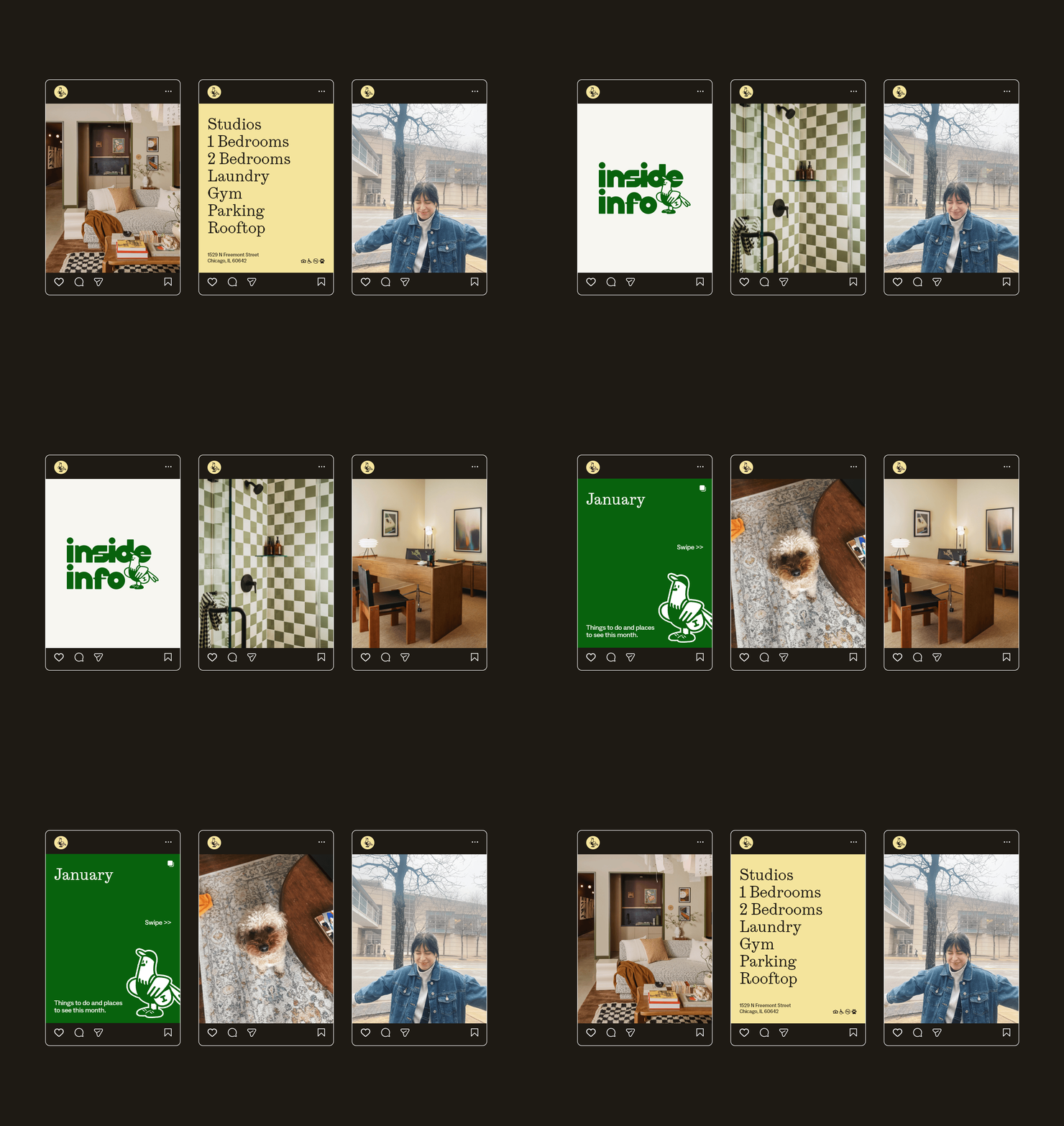
A brand and an interior built from the inside (info) out.

FOCUS

Positioning
Brand Concepting
Naming
Messaging
Brand & Identity Development
Collateral Design
Brand & Visual Guidelines
Interior Design
Web Design (JONAH)
Wayfinding & Signage
Uniform Design
Mural
Campaign Ideation
Lifestyle Photography
Renderings
Mascot Design
Music Programming
Scent Development

‍

Interior Design: By The Studio
Wayfinding & Signage: Blank Studio
Mural: Johalla Projects
Interior Photography: Sarah Crowley
Lifestyle Photography: Field Creatives
Mascot Design: Chicago Mascots

Positioning
Brand Concepting
Naming
Messaging
Brand & Identity Development
Collateral Design
Brand & Visual Guidelines
Interior Design
Web Design (JONAH)
Wayfinding & Signage
Uniform Design
Mural
Campaign Ideation
Lifestyle Photography
Renderings
Mascot Design
Music Programming
Scent Development

‍

Interior Design: By The Studio
Wayfinding & Signage: Blank Studio
Mural: Johalla Projects
Interior Photography: Sarah Crowley
Lifestyle Photography: Field Creatives
Mascot Design: Chicago Mascots

APPROACH
APPROACH

CityPads knew exactly what they wanted to build. What they didn't have was a way to say it out loud.

‍

They had the strategy, the sites, the instinct for who they were building for, and the knack for building a quality product. What they were missing was the translation layer: how to turn a development thesis into a brand a renter would actually feel something for. That's where we came in.

‍

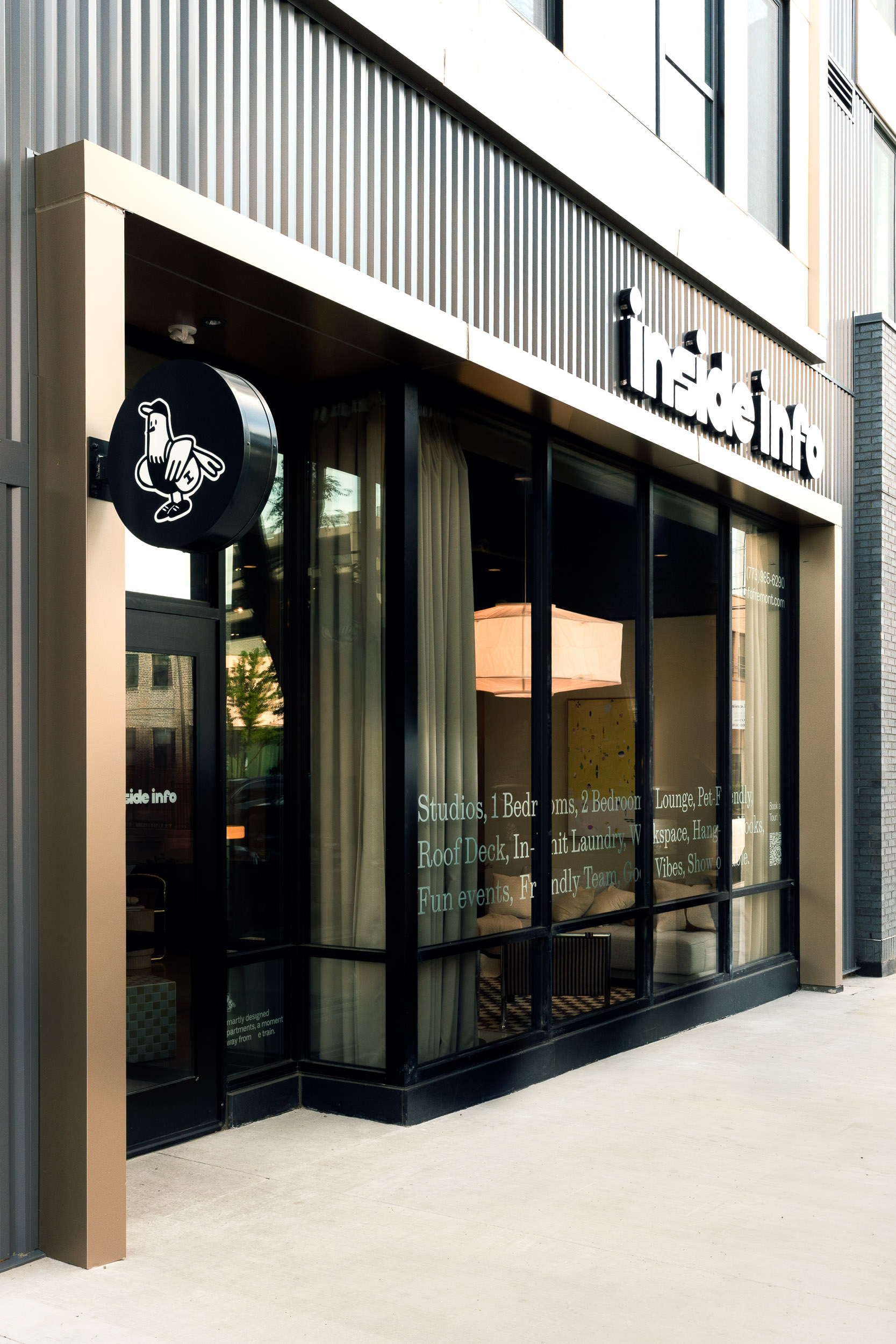
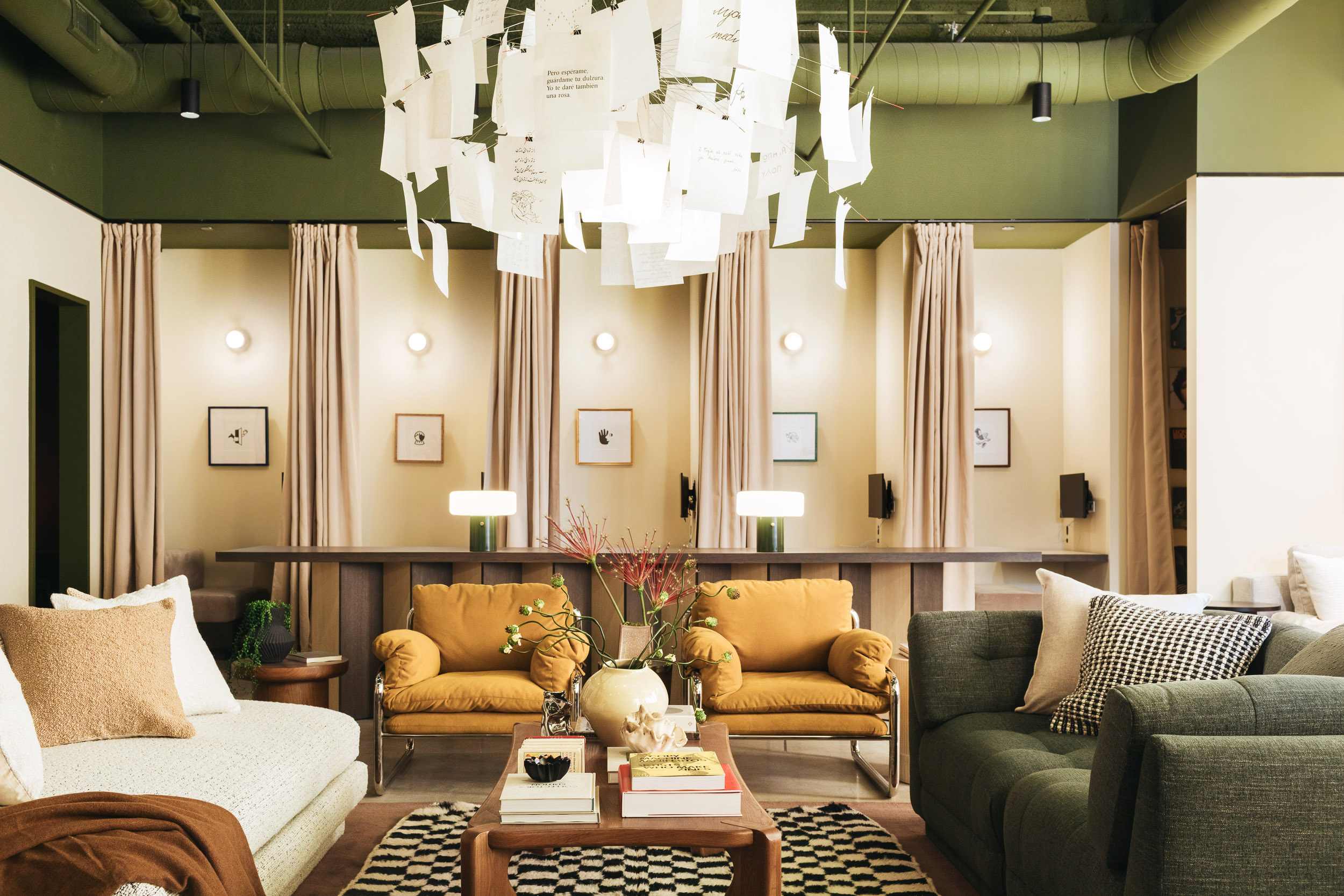
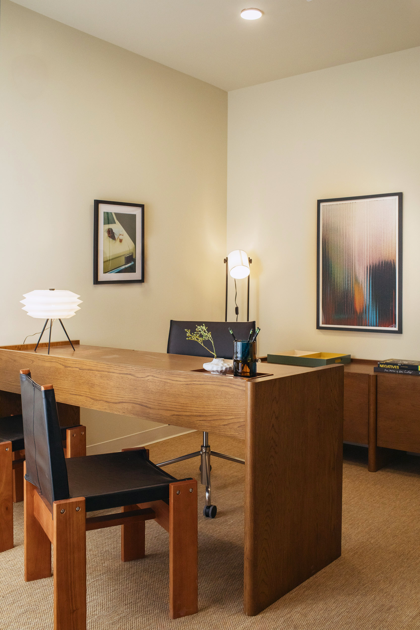
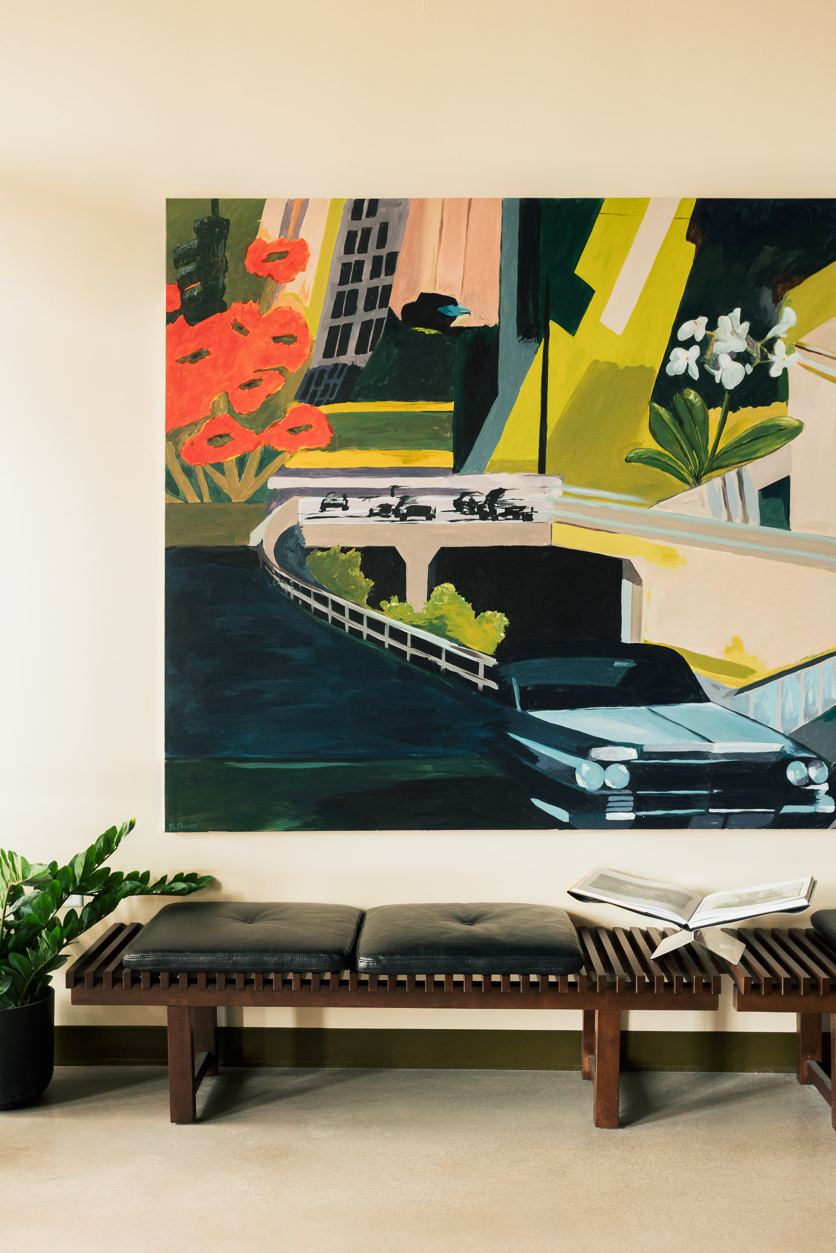
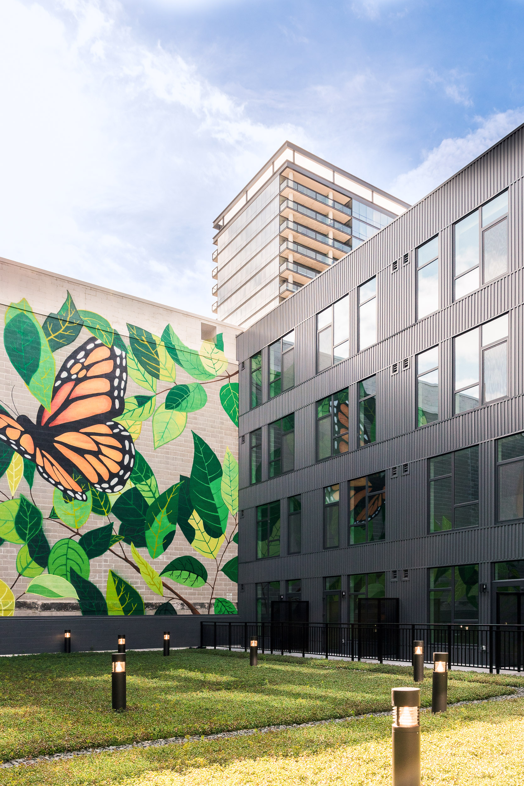
We led positioning, naming, and brand identity from the ground up, and we designed the interiors to reflect that story. We dug into who this audience actually is: their personalities, their backgrounds, their taste in life and style, the things they're already out there doing. Then we made all of it the center of their world. The quality, the lifestyle, the experience they run into every single day. Every space we built reflects those values back at them. Comfortable. Stylish. Chic. We covered full interiors, wayfinding and signage, uniform design, music programming, scenting, and a mural, all pulling from the same brief.

‍

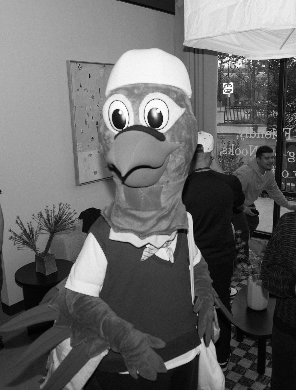
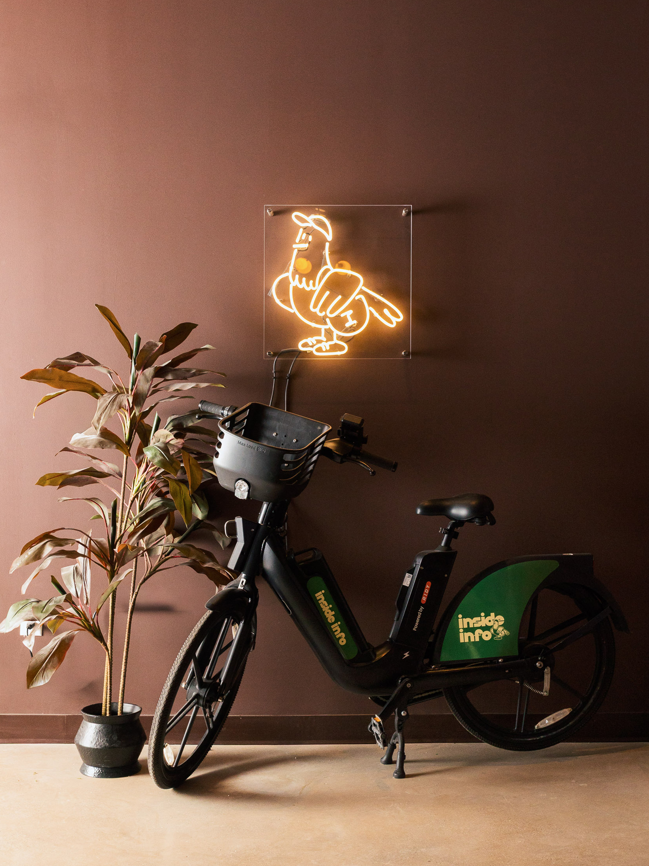
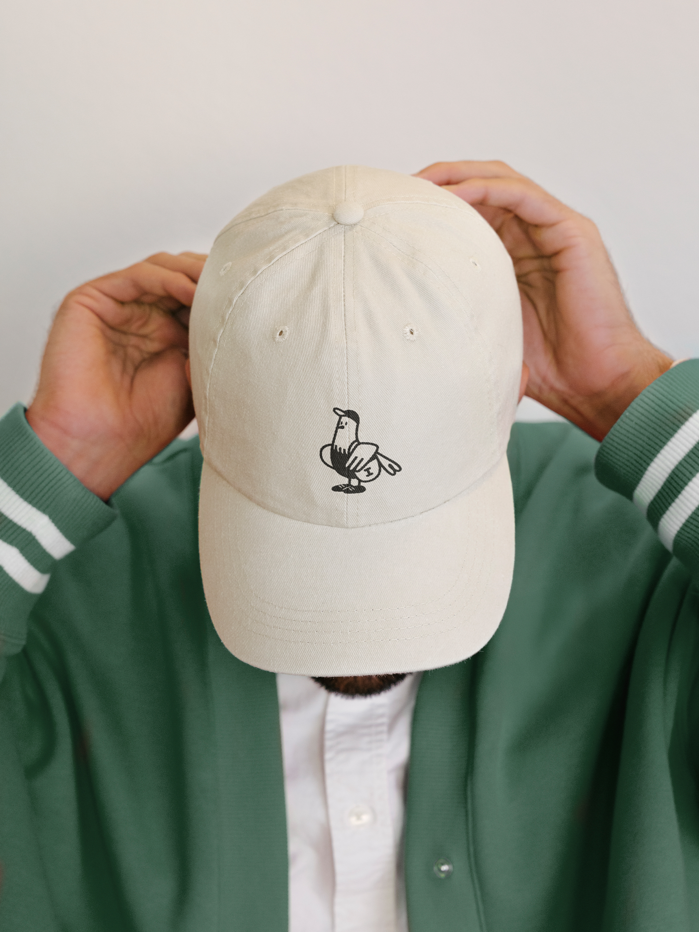
Oh, and we built a mascot. His name is Wally. He's a city pigeon with an actual backstory: a design degree, a shift at the record shop, a habit of recognizing neighbors on the street. It's a lot of detail for something that mostly shows up as an illustration on a wall, but that's the part we cared about getting right.

‍

‍

CityPads
Chicago, IL

The inside scoop on how we arrived here.

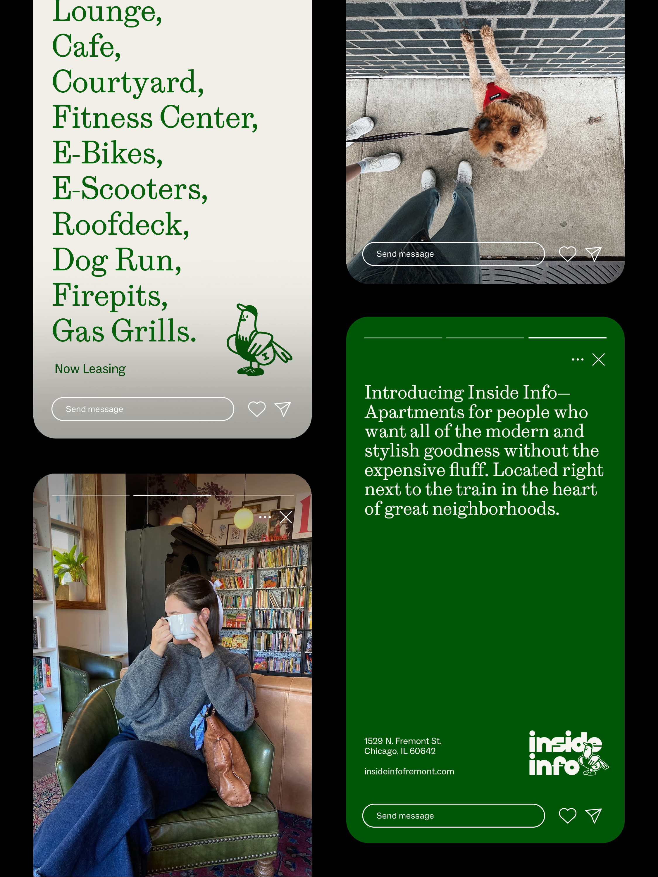
We built the name around a simple idea: the best information about a neighborhood never comes from a leasing website (nor should it). It comes from the person already living there. The person who knows where to get the best nitro cold brew in the area. When to leave the apartment to catch the Southbound CTA Red Line so you're at work by 9 AM. Which nights Steppenwolf does pay-what-you-can. The name of the dog in the neighboring building whose owner decided pink highlights and a braided tail were "the look." Who's playing at the Salt Shed on Saturday. How far of a bike ride it is to Armitage or the lakefront trail. The unwritten rule that the Whole Foods on Halsted gets a line by 5:30 PM.

So naturally, the brand had to talk like that person. Straight forward, honest, a little funny, and anti general property management-speak.

‍

CityPads
Chicago, IL

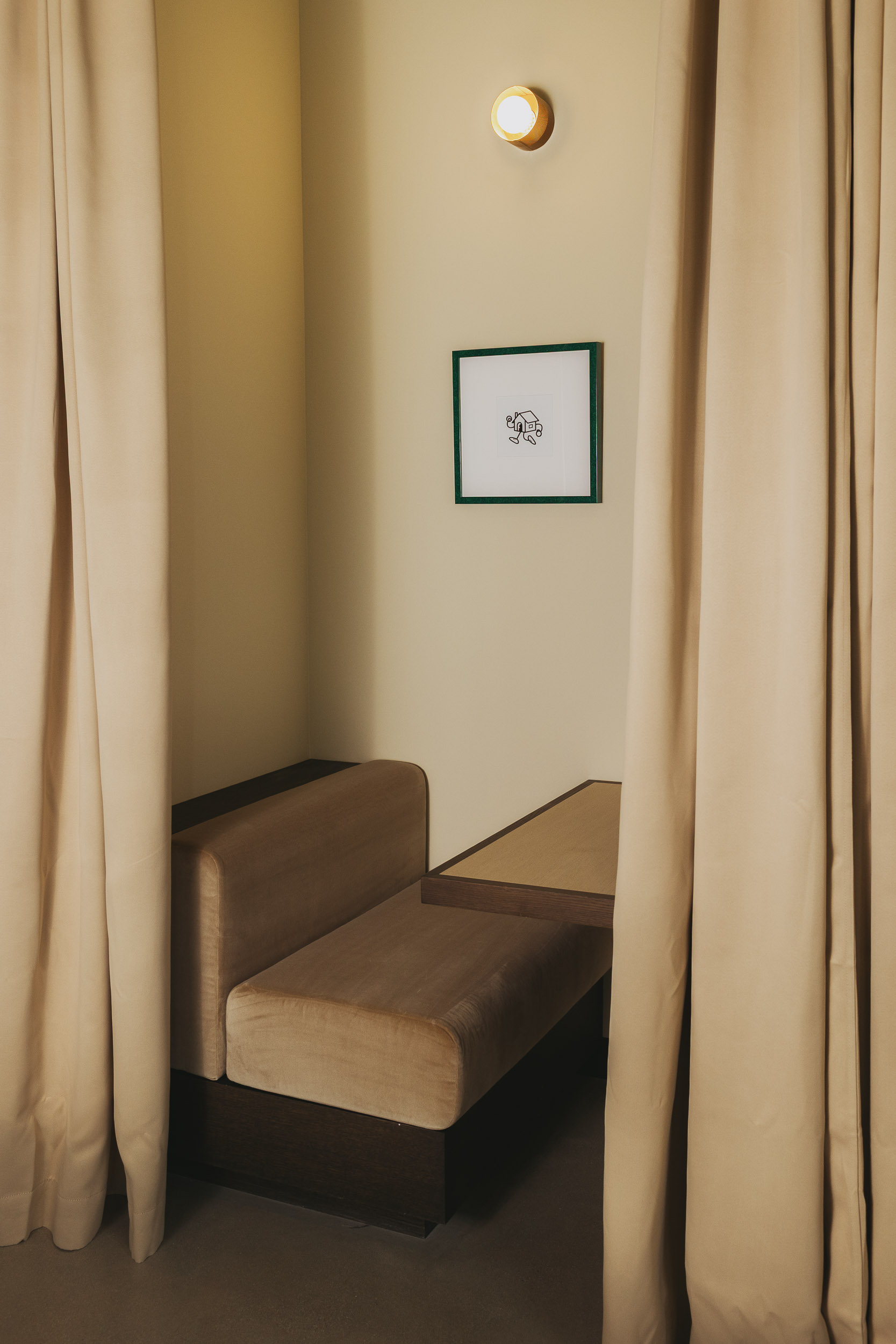
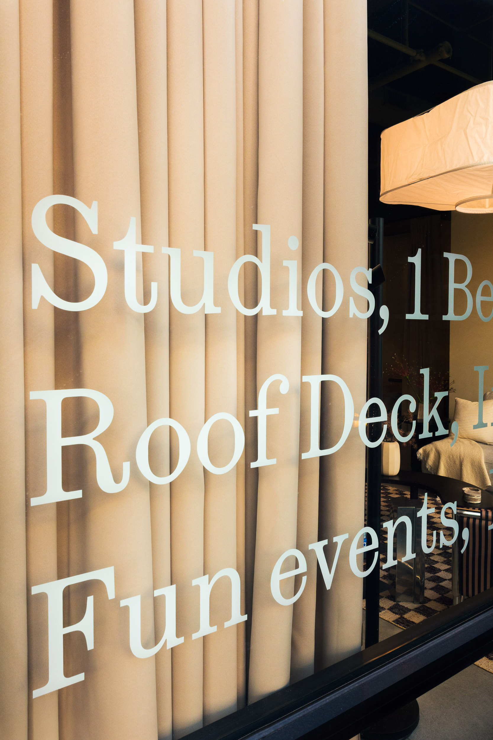
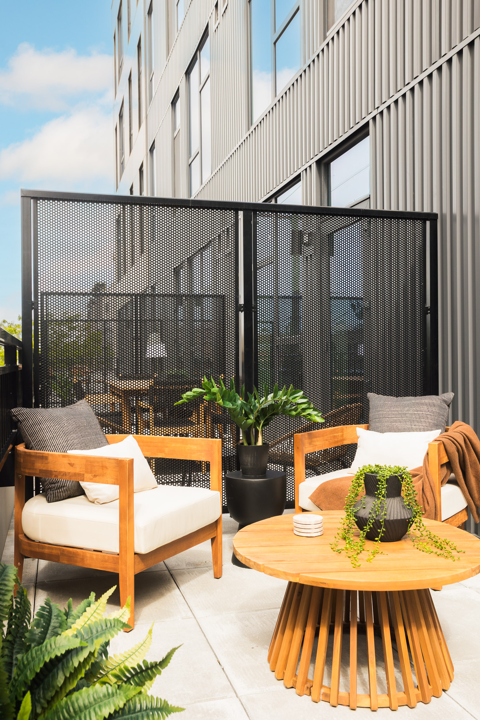
Brand-led interiors mean the design starts with who you're building for, not the other way around. Common areas are built for the version of hanging out that doesn't require an invitation, small enough to feel like your living room, open enough to run into someone. That same thinking carries all the way into the unit: checkered tile in the bathroom, painted interior cabinets, finishes that keep the brand present without taking over the whole room. Enough for it to still feel like Inside Info, enough room left for it to feel like someone's own place. Wally, our beloved pigeon? Yeah, he's around.

‍

CityPads

THE SHORT

Step in, stand out.

ID
Chicago, IL

A brand and an interior built from the inside (info) out.

FOCUS

/Approach

What’s a Rich Text element?

The rich text element allows you to create and format headings, paragraphs, blockquotes, images, and video all in one place instead of having to add and format them individually. Just double-click and easily create content.

Static and dynamic content editing

A rich text element can be used with static or dynamic content. For static content, just drop it into any page and begin editing. For dynamic content, add a rich text field to any collection and then connect a rich text element to that field in the settings panel. Voila!

How to customize formatting for each rich text

Headings, paragraphs, blockquotes, figures, images, and figure captions can all be styled after a class is added to the rich text element using the "When inside of" nested selector system.

Lorem ipsum dolor sit amet, consetetur sadipscing elitr, sed diam nonumy eirmod tempor invidunt ut labore et dolore magna aliquyam erat, sed diam voluptua. At vero eos et accusam et justo duo dolores et ea rebum.

Stet clita kasd.Lorem ipsum dolor sit amet, consetetur sadipscing elitr, sed diam nonumy eirmod tempor invidunt ut labore et dolore magna aliquyam erat, sed diam voluptua. At vero eos et accusam et justo duo dolores et ea rebum.

Step in, stand out.

Inside Info

THE SHORT

Step in, stand out.

CityPads
Chicago, IL

A brand and an interior built from the inside (info) out.

FOCUS

Positioning
Brand Concepting
Naming
Messaging
Brand & Identity Development
Collateral Design
Brand & Visual Guidelines
Interior Design
Web Design (JONAH)
Wayfinding & Signage
Uniform Design
Mural
Campaign Ideation
Lifestyle Photography
Renderings
Mascot Design
Music Programming
Scent Development

‍

Interior Design: By The Studio
Wayfinding & Signage: Blank Studio
Mural: Johalla Projects
Interior Photography: Sarah Crowley
Lifestyle Photography: Field Creatives
Mascot Design: Chicago Mascots

Positioning
Brand Concepting
Naming
Messaging
Brand & Identity Development
Collateral Design
Brand & Visual Guidelines
Interior Design
Web Design (JONAH)
Wayfinding & Signage
Uniform Design
Mural
Campaign Ideation
Lifestyle Photography
Renderings
Mascot Design
Music Programming
Scent Development

‍

Interior Design: By The Studio
Wayfinding & Signage: Blank Studio
Mural: Johalla Projects
Interior Photography: Sarah Crowley
Lifestyle Photography: Field Creatives
Mascot Design: Chicago Mascots

APPROACH
APPROACH

CityPads knew exactly what they wanted to build. What they didn't have was a way to say it out loud.

‍

They had the strategy, the sites, the instinct for who they were building for, and the knack for building a quality product. What they were missing was the translation layer: how to turn a development thesis into a brand a renter would actually feel something for. That's where we came in.

‍

We led positioning, naming, and brand identity from the ground up, and we designed the interiors to reflect that story. We dug into who this audience actually is: their personalities, their backgrounds, their taste in life and style, the things they're already out there doing. Then we made all of it the center of their world. The quality, the lifestyle, the experience they run into every single day. Every space we built reflects those values back at them. Comfortable. Stylish. Chic. We covered full interiors, wayfinding and signage, uniform design, music programming, scenting, and a mural, all pulling from the same brief.

‍

Oh, and we built a mascot. His name is Wally. He's a city pigeon with an actual backstory: a design degree, a shift at the record shop, a habit of recognizing neighbors on the street. It's a lot of detail for something that mostly shows up as an illustration on a wall, but that's the part we cared about getting right.

‍

‍

CityPads
Chicago, IL

THE GOODS

We built the name around a simple idea: the best information about a neighborhood never comes from a leasing website (nor should it). It comes from the person already living there. The person who knows where to get the best nitro cold brew in the area. When to leave the apartment to catch the Southbound CTA Red Line so you're at work by 9 AM. Which nights Steppenwolf does pay-what-you-can. The name of the dog in the neighboring building whose owner decided pink highlights and a braided tail were "the look." Who's playing at the Salt Shed on Saturday. How far of a bike ride it is to Armitage or the lakefront trail. The unwritten rule that the Whole Foods on Halsted gets a line by 5:30 PM.

So naturally, the brand had to talk like that person. Straight forward, honest, a little funny, and anti general property management-speak.

‍

CityPads
Chicago, IL

THE SPACE

Brand-led interiors mean the design starts with who you're building for, not the other way around. Common areas are built for the version of hanging out that doesn't require an invitation, small enough to feel like your living room, open enough to run into someone. That same thinking carries all the way into the unit: checkered tile in the bathroom, painted interior cabinets, finishes that keep the brand present without taking over the whole room. Enough for it to still feel like Inside Info, enough room left for it to feel like someone's own place. Wally, our beloved pigeon? Yeah, he's around.

‍

Inside Info

THE SHORT

Step in, stand out.

CityPads
Chicago, IL

A brand and an interior built from the inside (info) out.

FOCUS

Positioning
Brand Concepting
Naming
Messaging
Brand & Identity Development
Collateral Design
Brand & Visual Guidelines
Interior Design
Web Design (JONAH)
Wayfinding & Signage
Uniform Design
Mural
Campaign Ideation
Lifestyle Photography
Renderings
Mascot Design
Music Programming
Scent Development

‍

Interior Design: By The Studio
Wayfinding & Signage: Blank Studio
Mural: Johalla Projects
Interior Photography: Sarah Crowley
Lifestyle Photography: Field Creatives
Mascot Design: Chicago Mascots

Positioning
Brand Concepting
Naming
Messaging
Brand & Identity Development
Collateral Design
Brand & Visual Guidelines
Interior Design
Web Design (JONAH)
Wayfinding & Signage
Uniform Design
Mural
Campaign Ideation
Lifestyle Photography
Renderings
Mascot Design
Music Programming
Scent Development

‍

Interior Design: By The Studio
Wayfinding & Signage: Blank Studio
Mural: Johalla Projects
Interior Photography: Sarah Crowley
Lifestyle Photography: Field Creatives
Mascot Design: Chicago Mascots

APPROACH
APPROACH

CityPads knew exactly what they wanted to build. What they didn't have was a way to say it out loud.

‍

They had the strategy, the sites, the instinct for who they were building for, and the knack for building a quality product. What they were missing was the translation layer: how to turn a development thesis into a brand a renter would actually feel something for. That's where we came in.

‍

We led positioning, naming, and brand identity from the ground up, and we designed the interiors to reflect that story. We dug into who this audience actually is: their personalities, their backgrounds, their taste in life and style, the things they're already out there doing. Then we made all of it the center of their world. The quality, the lifestyle, the experience they run into every single day. Every space we built reflects those values back at them. Comfortable. Stylish. Chic. We covered full interiors, wayfinding and signage, uniform design, music programming, scenting, and a mural, all pulling from the same brief.

‍

Oh, and we built a mascot. His name is Wally. He's a city pigeon with an actual backstory: a design degree, a shift at the record shop, a habit of recognizing neighbors on the street. It's a lot of detail for something that mostly shows up as an illustration on a wall, but that's the part we cared about getting right.

‍

‍

CityPads
Chicago, IL

The inside scoop on how we arrived here.

We built the name around a simple idea: the best information about a neighborhood never comes from a leasing website (nor should it). It comes from the person already living there. The person who knows where to get the best nitro cold brew in the area. When to leave the apartment to catch the Southbound CTA Red Line so you're at work by 9 AM. Which nights Steppenwolf does pay-what-you-can. The name of the dog in the neighboring building whose owner decided pink highlights and a braided tail were "the look." Who's playing at the Salt Shed on Saturday. How far of a bike ride it is to Armitage or the lakefront trail. The unwritten rule that the Whole Foods on Halsted gets a line by 5:30 PM.

So naturally, the brand had to talk like that person. Straight forward, honest, a little funny, and anti general property management-speak.

‍

Inside Info

THE SHORT

Step in, stand out.

CityPads
Chicago, IL

A brand and an interior built from the inside (info) out.

FOCUS

Positioning
Brand Concepting
Naming
Messaging
Brand & Identity Development
Collateral Design
Brand & Visual Guidelines
Interior Design
Web Design (JONAH)
Wayfinding & Signage
Uniform Design
Mural
Campaign Ideation
Lifestyle Photography
Renderings
Mascot Design
Music Programming
Scent Development

‍

Interior Design: By The Studio
Wayfinding & Signage: Blank Studio
Mural: Johalla Projects
Interior Photography: Sarah Crowley
Lifestyle Photography: Field Creatives
Mascot Design: Chicago Mascots

Positioning
Brand Concepting
Naming
Messaging
Brand & Identity Development
Collateral Design
Brand & Visual Guidelines
Interior Design
Web Design (JONAH)
Wayfinding & Signage
Uniform Design
Mural
Campaign Ideation
Lifestyle Photography
Renderings
Mascot Design
Music Programming
Scent Development

‍

Interior Design: By The Studio
Wayfinding & Signage: Blank Studio
Mural: Johalla Projects
Interior Photography: Sarah Crowley
Lifestyle Photography: Field Creatives
Mascot Design: Chicago Mascots

APPROACH
APPROACH

CityPads knew exactly what they wanted to build. What they didn't have was a way to say it out loud.

‍

They had the strategy, the sites, the instinct for who they were building for, and the knack for building a quality product. What they were missing was the translation layer: how to turn a development thesis into a brand a renter would actually feel something for. That's where we came in.

‍

We led positioning, naming, and brand identity from the ground up, and we designed the interiors to reflect that story. We dug into who this audience actually is: their personalities, their backgrounds, their taste in life and style, the things they're already out there doing. Then we made all of it the center of their world. The quality, the lifestyle, the experience they run into every single day. Every space we built reflects those values back at them. Comfortable. Stylish. Chic. We covered full interiors, wayfinding and signage, uniform design, music programming, scenting, and a mural, all pulling from the same brief.

‍

Oh, and we built a mascot. His name is Wally. He's a city pigeon with an actual backstory: a design degree, a shift at the record shop, a habit of recognizing neighbors on the street. It's a lot of detail for something that mostly shows up as an illustration on a wall, but that's the part we cared about getting right.

‍

‍

CityPads
Chicago, IL

The inside scoop on how we arrived here.

We built the name around a simple idea: the best information about a neighborhood never comes from a leasing website (nor should it). It comes from the person already living there. The person who knows where to get the best nitro cold brew in the area. When to leave the apartment to catch the Southbound CTA Red Line so you're at work by 9 AM. Which nights Steppenwolf does pay-what-you-can. The name of the dog in the neighboring building whose owner decided pink highlights and a braided tail were "the look." Who's playing at the Salt Shed on Saturday. How far of a bike ride it is to Armitage or the lakefront trail. The unwritten rule that the Whole Foods on Halsted gets a line by 5:30 PM.

So naturally, the brand had to talk like that person. Straight forward, honest, a little funny, and anti general property management-speak.

‍

CityPads
Chicago, IL

Brand-led interiors mean the design starts with who you're building for, not the other way around. Common areas are built for the version of hanging out that doesn't require an invitation, small enough to feel like your living room, open enough to run into someone. That same thinking carries all the way into the unit: checkered tile in the bathroom, painted interior cabinets, finishes that keep the brand present without taking over the whole room. Enough for it to still feel like Inside Info, enough room left for it to feel like someone's own place. Wally, our beloved pigeon? Yeah, he's around.

‍

Inside Info

THE SHORT

Step in, stand out.

CityPads
Chicago, IL

A brand and an interior built from the inside (info) out.

FOCUS

Positioning
Brand Concepting
Naming
Messaging
Brand & Identity Development
Collateral Design
Brand & Visual Guidelines
Interior Design
Web Design (JONAH)
Wayfinding & Signage
Uniform Design
Mural
Campaign Ideation
Lifestyle Photography
Renderings
Mascot Design
Music Programming
Scent Development

‍

Interior Design: By The Studio
Wayfinding & Signage: Blank Studio
Mural: Johalla Projects
Interior Photography: Sarah Crowley
Lifestyle Photography: Field Creatives
Mascot Design: Chicago Mascots

Positioning
Brand Concepting
Naming
Messaging
Brand & Identity Development
Collateral Design
Brand & Visual Guidelines
Interior Design
Web Design (JONAH)
Wayfinding & Signage
Uniform Design
Mural
Campaign Ideation
Lifestyle Photography
Renderings
Mascot Design
Music Programming
Scent Development

‍

Interior Design: By The Studio
Wayfinding & Signage: Blank Studio
Mural: Johalla Projects
Interior Photography: Sarah Crowley
Lifestyle Photography: Field Creatives
Mascot Design: Chicago Mascots

APPROACH
APPROACH

CityPads knew exactly what they wanted to build. What they didn't have was a way to say it out loud.

‍

They had the strategy, the sites, the instinct for who they were building for, and the knack for building a quality product. What they were missing was the translation layer: how to turn a development thesis into a brand a renter would actually feel something for. That's where we came in.

‍

We led positioning, naming, and brand identity from the ground up, and we designed the interiors to reflect that story. We dug into who this audience actually is: their personalities, their backgrounds, their taste in life and style, the things they're already out there doing. Then we made all of it the center of their world. The quality, the lifestyle, the experience they run into every single day. Every space we built reflects those values back at them. Comfortable. Stylish. Chic. We covered full interiors, wayfinding and signage, uniform design, music programming, scenting, and a mural, all pulling from the same brief.

‍

Oh, and we built a mascot. His name is Wally. He's a city pigeon with an actual backstory: a design degree, a shift at the record shop, a habit of recognizing neighbors on the street. It's a lot of detail for something that mostly shows up as an illustration on a wall, but that's the part we cared about getting right.

‍

‍

CityPads
Chicago, IL

The inside scoop on how we arrived here.

We built the name around a simple idea: the best information about a neighborhood never comes from a leasing website (nor should it). It comes from the person already living there. The person who knows where to get the best nitro cold brew in the area. When to leave the apartment to catch the Southbound CTA Red Line so you're at work by 9 AM. Which nights Steppenwolf does pay-what-you-can. The name of the dog in the neighboring building whose owner decided pink highlights and a braided tail were "the look." Who's playing at the Salt Shed on Saturday. How far of a bike ride it is to Armitage or the lakefront trail. The unwritten rule that the Whole Foods on Halsted gets a line by 5:30 PM.

So naturally, the brand had to talk like that person. Straight forward, honest, a little funny, and anti general property management-speak.

‍

CityPads
Chicago, IL

Brand-led interiors mean the design starts with who you're building for, not the other way around. Common areas are built for the version of hanging out that doesn't require an invitation, small enough to feel like your living room, open enough to run into someone. That same thinking carries all the way into the unit: checkered tile in the bathroom, painted interior cabinets, finishes that keep the brand present without taking over the whole room. Enough for it to still feel like Inside Info, enough room left for it to feel like someone's own place. Wally, our beloved pigeon? Yeah, he's around.

‍

Inside Info

THE SHORT

Step in, stand out.

CityPads
Chicago, IL

A brand and an interior built from the inside (info) out.

FOCUS

Positioning
Brand Concepting
Naming
Messaging
Brand & Identity Development
Collateral Design
Brand & Visual Guidelines
Interior Design
Web Design (JONAH)
Wayfinding & Signage
Uniform Design
Mural
Campaign Ideation
Lifestyle Photography
Renderings
Mascot Design
Music Programming
Scent Development

‍

Interior Design: By The Studio
Wayfinding & Signage: Blank Studio
Mural: Johalla Projects
Interior Photography: Sarah Crowley
Lifestyle Photography: Field Creatives
Mascot Design: Chicago Mascots

Positioning
Brand Concepting
Naming
Messaging
Brand & Identity Development
Collateral Design
Brand & Visual Guidelines
Interior Design
Web Design (JONAH)
Wayfinding & Signage
Uniform Design
Mural
Campaign Ideation
Lifestyle Photography
Renderings
Mascot Design
Music Programming
Scent Development

‍

Interior Design: By The Studio
Wayfinding & Signage: Blank Studio
Mural: Johalla Projects
Interior Photography: Sarah Crowley
Lifestyle Photography: Field Creatives
Mascot Design: Chicago Mascots

APPROACH
APPROACH

CityPads knew exactly what they wanted to build. What they didn't have was a way to say it out loud.

‍

They had the strategy, the sites, the instinct for who they were building for, and the knack for building a quality product. What they were missing was the translation layer: how to turn a development thesis into a brand a renter would actually feel something for. That's where we came in.

‍

We led positioning, naming, and brand identity from the ground up, and we designed the interiors to reflect that story. We dug into who this audience actually is: their personalities, their backgrounds, their taste in life and style, the things they're already out there doing. Then we made all of it the center of their world. The quality, the lifestyle, the experience they run into every single day. Every space we built reflects those values back at them. Comfortable. Stylish. Chic. We covered full interiors, wayfinding and signage, uniform design, music programming, scenting, and a mural, all pulling from the same brief.

‍

Oh, and we built a mascot. His name is Wally. He's a city pigeon with an actual backstory: a design degree, a shift at the record shop, a habit of recognizing neighbors on the street. It's a lot of detail for something that mostly shows up as an illustration on a wall, but that's the part we cared about getting right.

‍

‍

CityPads
Chicago, IL

The inside scoop on how we arrived here.

We built the name around a simple idea: the best information about a neighborhood never comes from a leasing website (nor should it). It comes from the person already living there. The person who knows where to get the best nitro cold brew in the area. When to leave the apartment to catch the Southbound CTA Red Line so you're at work by 9 AM. Which nights Steppenwolf does pay-what-you-can. The name of the dog in the neighboring building whose owner decided pink highlights and a braided tail were "the look." Who's playing at the Salt Shed on Saturday. How far of a bike ride it is to Armitage or the lakefront trail. The unwritten rule that the Whole Foods on Halsted gets a line by 5:30 PM.

So naturally, the brand had to talk like that person. Straight forward, honest, a little funny, and anti general property management-speak.

‍

CityPads
Chicago, IL

Brand-led interiors mean the design starts with who you're building for, not the other way around. Common areas are built for the version of hanging out that doesn't require an invitation, small enough to feel like your living room, open enough to run into someone. That same thinking carries all the way into the unit: checkered tile in the bathroom, painted interior cabinets, finishes that keep the brand present without taking over the whole room. Enough for it to still feel like Inside Info, enough room left for it to feel like someone's own place. Wally, our beloved pigeon? Yeah, he's around.

‍

more work

A
A
A
A
A
A
A
A
A
A
A
A
A
A
A
A
A
A
A
A
A
A
A
A
A
A
A
A
A
A
A
A
A
A
A
A
A
A
A
A
A
A
A
A
A
A
A
A
A
A
A
A
A
A
A
A
A
A
A
A

Ready to do something different? Yeah, us too.

PARTNER WITH NO WALLS TO BRING TO LIFE THAT NEW CONCEPT, BRAND RELAUNCH, OR INDUSTRY CROSSOVER IDEA. WE HAVE THE EXPERTISE AND CREATIVITY TO HELP YOUR BUSINESS WIN.